Finding Accessible Patterns for Charts
Client
Workday
Year
2018
I aimed to design a pattern library to help people with color blindness. In two months, I audited the current framework, conceptualized a pattern approach, executed the designs, and tested the patterns internally. I enjoy making the internet more accessible and was thrilled to work on this project.
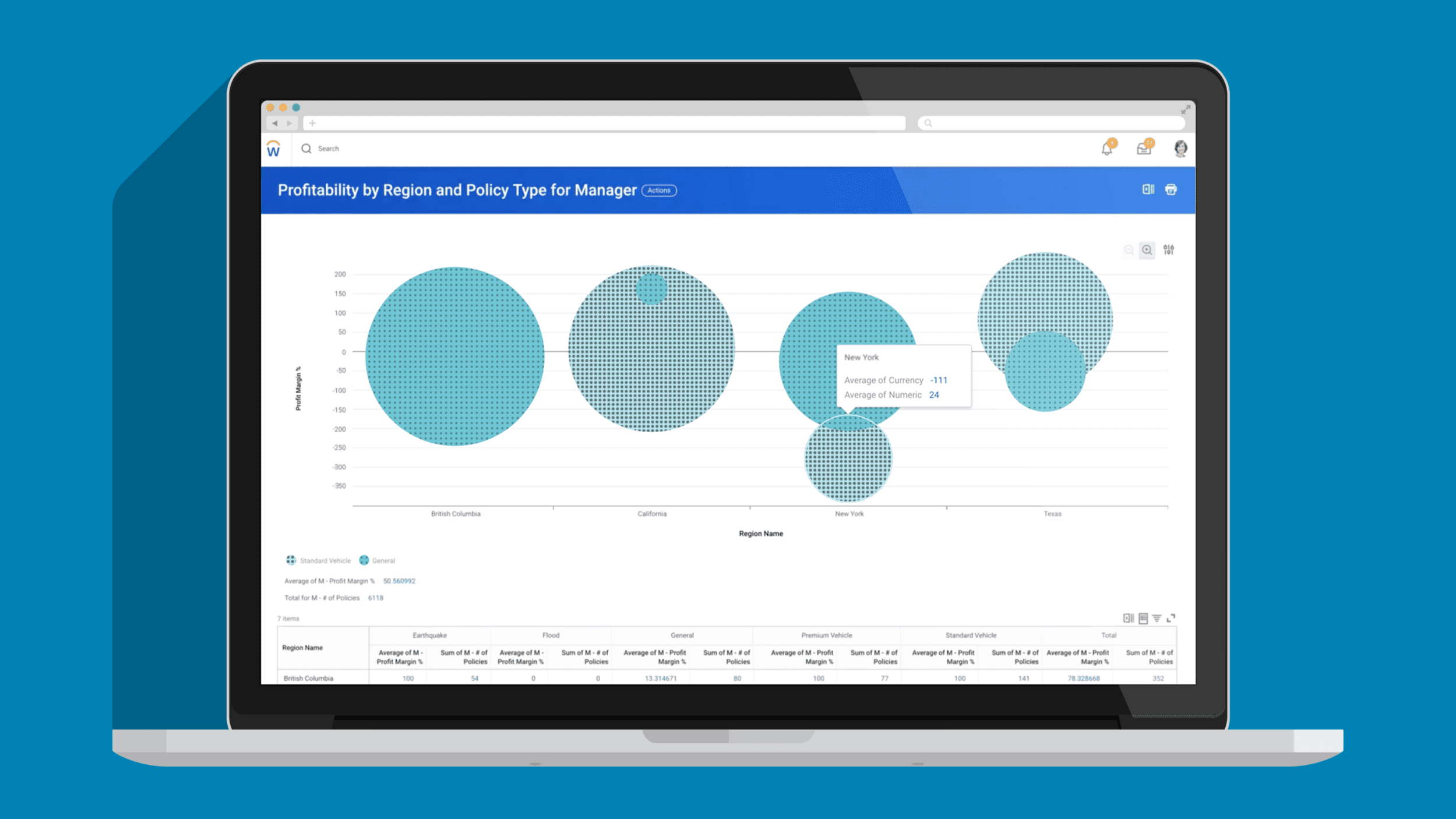
When I began this project, the existing accessibility feature didn't align with the design system colors, and there was no logic for how the patterns were displayed.
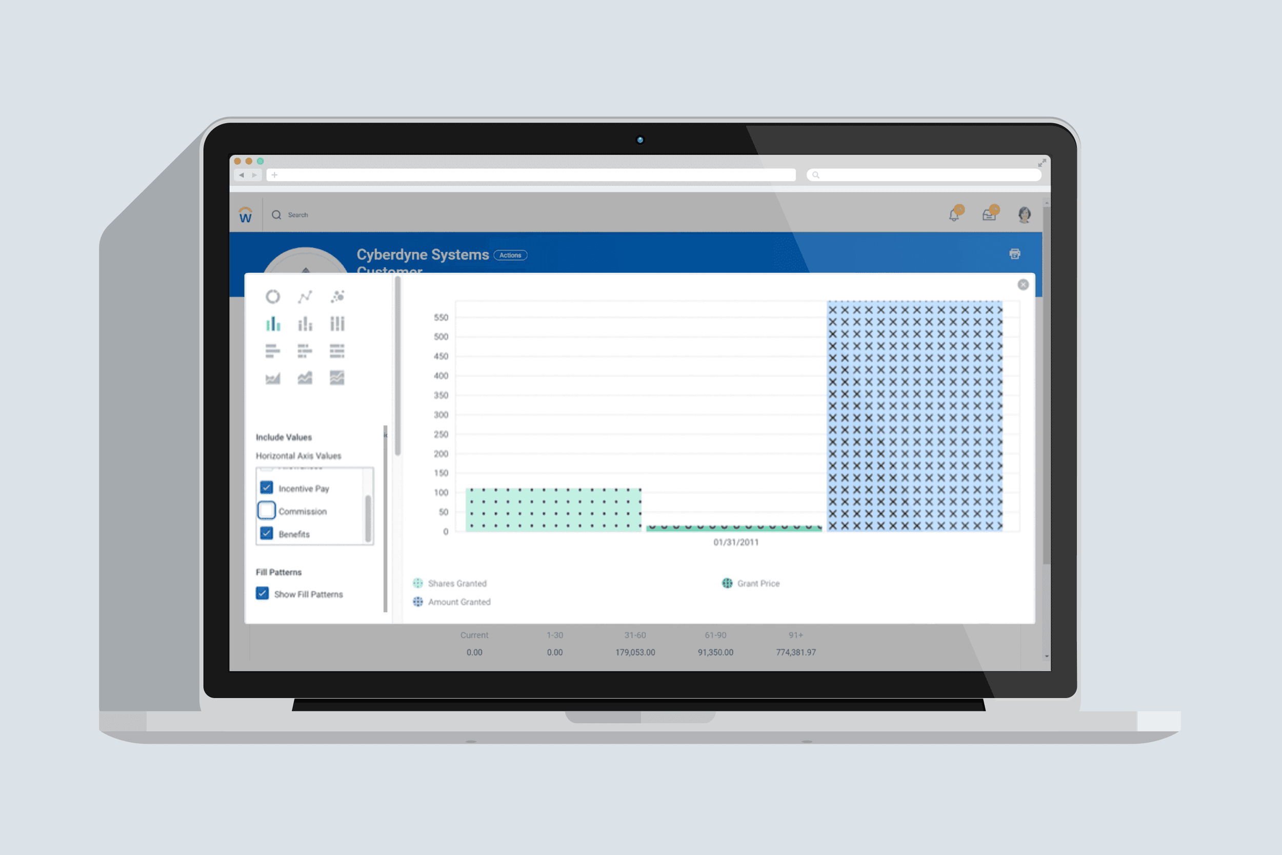
After selecting basic elements to examine the density in space, I explored options from less dense to denser patterns. Once I selected patterns, I began incorporating colors from the design system.
Based on legibility standards, I used color interpolation methods for blending between the two values. This resulted in a set of high-contrast color and fill pattern pairs.
The new color schemes and fill patterns significantly improved accessibility across the platform, making it easier for a wider range of individuals to navigate and interact with charts in the Workday enterprise.
Accessibility Design
Design Systems
Color Interpolation

