


In 2018, Workday was in the process of replacing their charting library, based on d3, with a new charting library built for larger data sets. The design system needed to be updated to address a variety of concerns, with the most critical being the accessibility of fill patterns used to represent color.
I started the engagement by researching the current fill patterns used in the d3 based visualizations. The existing patterns were not coordinated with the current design system, and many of them were difficult to decipher at a small scale. I needed to design a new set of patterns that would solve these areas.
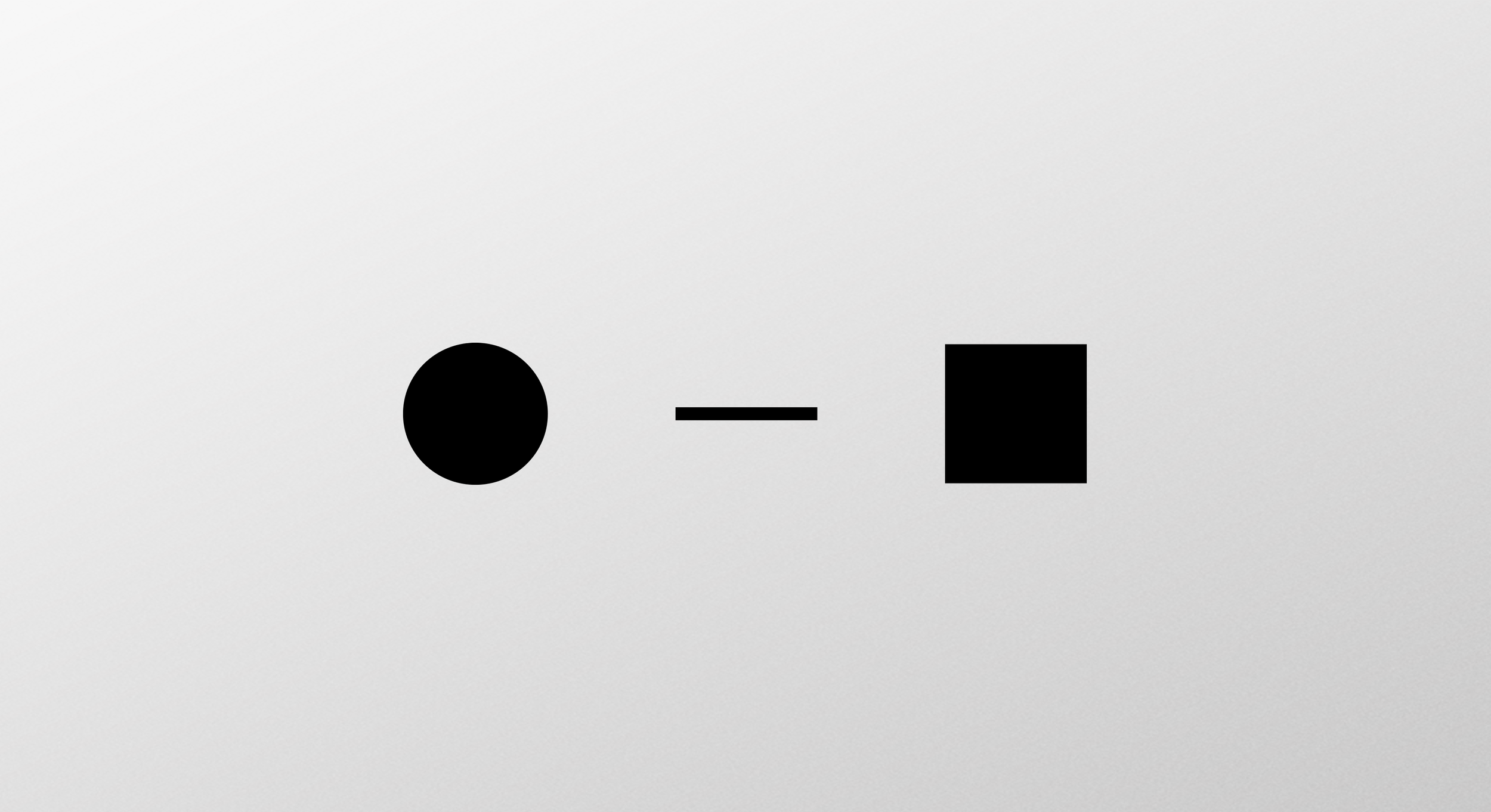
I took a clean slate approach to design the fill patterns. I started by selecting basic elements to explore the density in space. As I began to explore less dense to higher dense options, the foreground and background revealed new shapes to work with. For example, crossed lines revealed diamonds in the negative space.
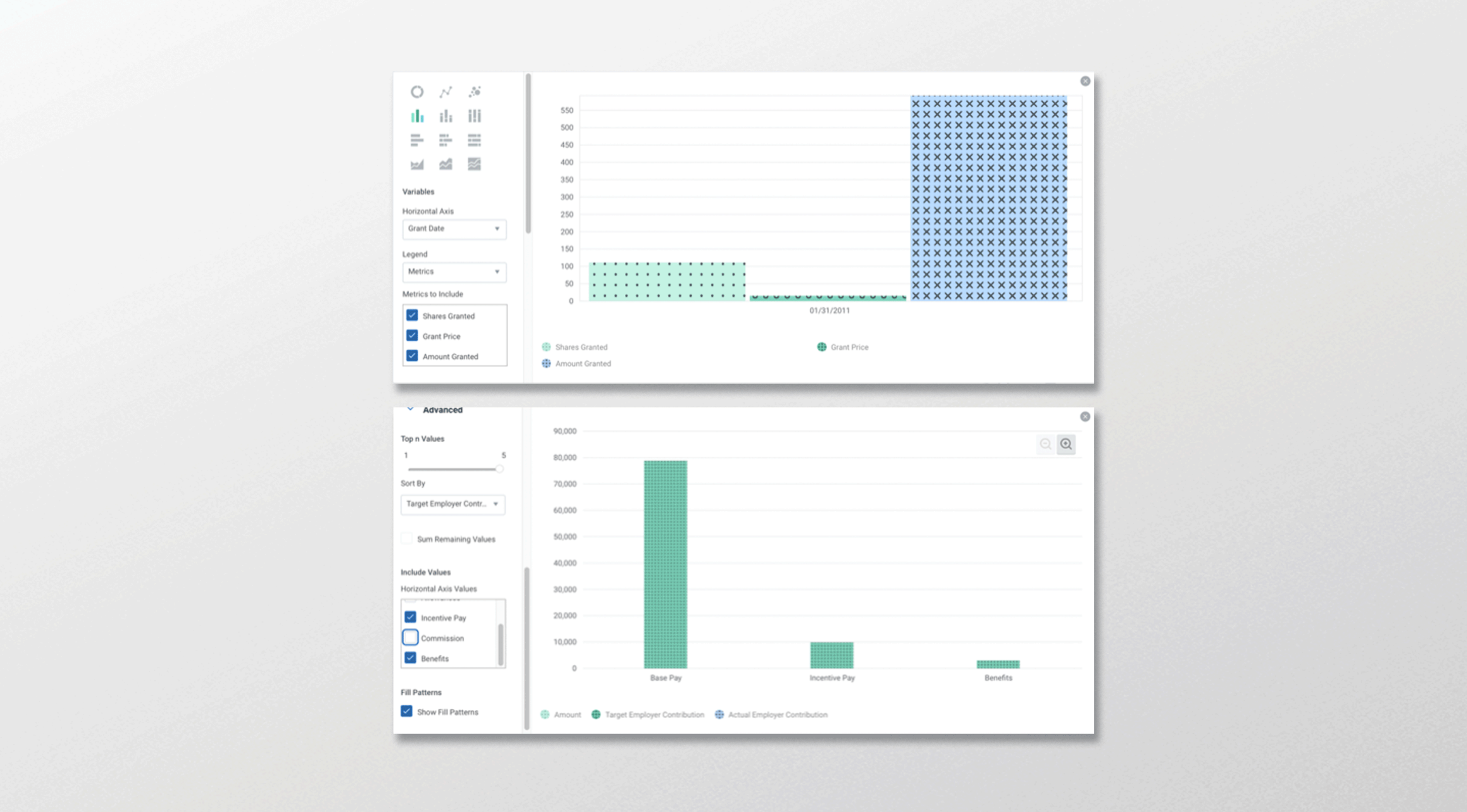
The chart system had to support a wide variety of chart sizes. The biggest challenge was finding fill patterns that worked in small spaces. I worked closely with the developer, iterating through multiple prototypes, to select patterns that worked well in small spaces.
The existing implementation used 16px circles as identifiers in the legend. To improve fill pattern legibility, I proposed a rectangle shape that would allow for fill patterns to be recognizable at a small scale.
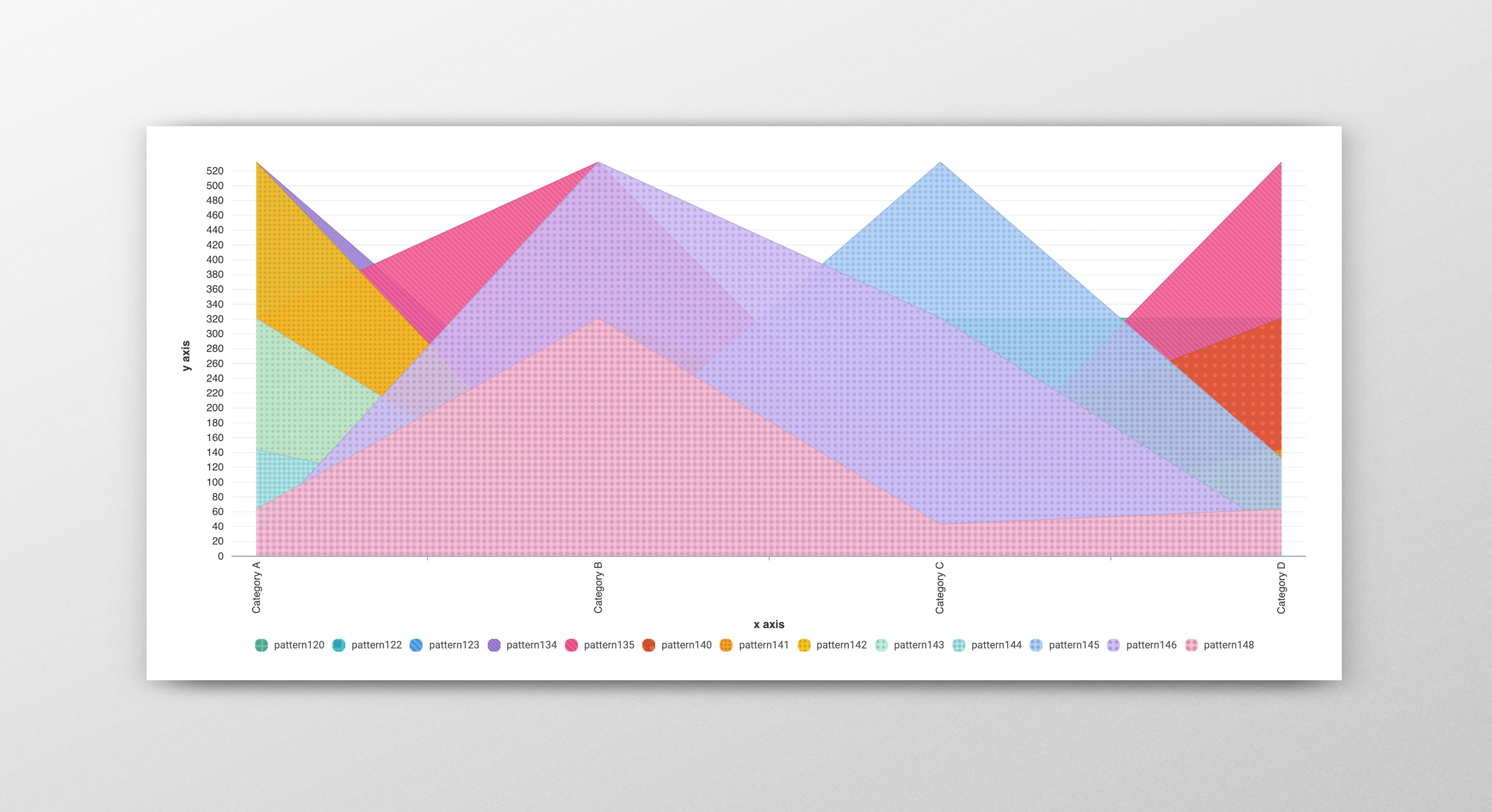
Once I selected patterns, I began to incorporate colors from the design system at Workday.
Defining the logic for how to use the solid colors in the fill pattern mode was the next step in determining the appropriate level of legibility. How could we determine the right level of fidelity in our patterns?
I worked with the developer to create a tool that evaluates the contrast levels between charting colors and the fill patterns to calculate a score based on legibility standards. It used color interpolation methods for blending between the two values. I used this tool to generate a set of high contrast color and fill pattern pairs.
After several iterations, I selected a version of the interpolated color for each fill pattern. We shipped this first version with limited internal testing, primarily based on the internal team's feedback. I normally would want to test the selection with users and with different screens, but we were working under intense time constraints and shipped my recommendations for the first release.
The project was well-received by users and the color and fill patterns improved accessibility across the platform.